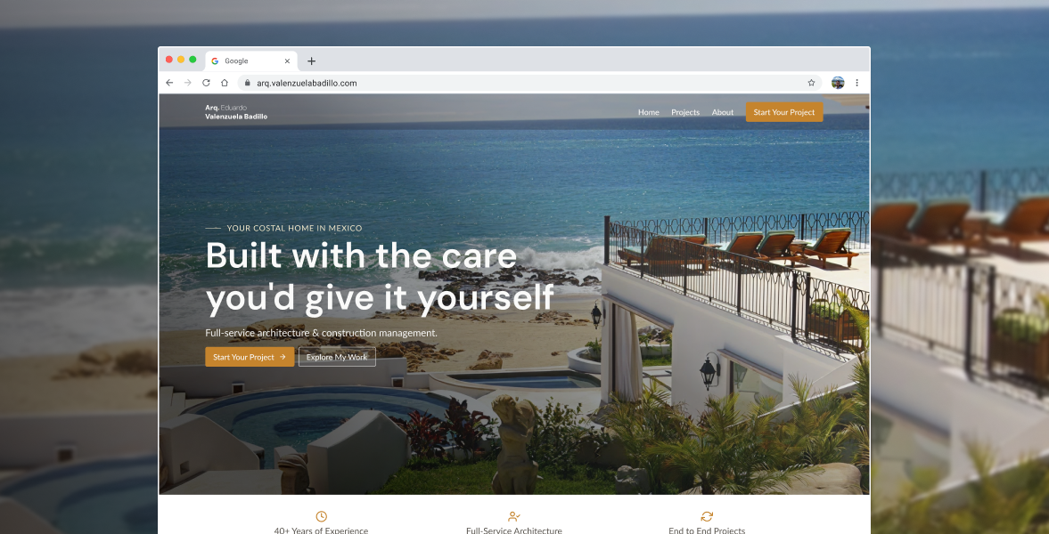
The portfolio redesign for Architect Eduardo Valenzuela Badillo Portfolio was created to modernize an outdated digital presence and reposition the architect toward a more premium international audience.
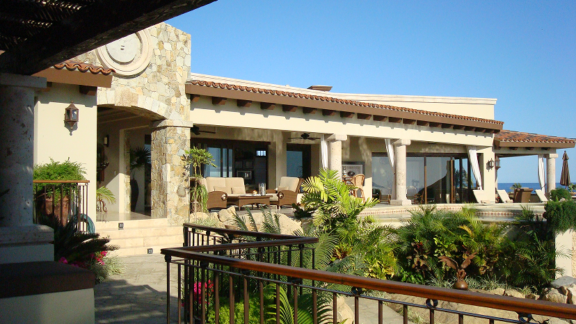
Specializing primarily in residential architecture across Baja California, Eduardo’s work reflects a coastal modern aesthetic shaped by the desert landscapes and ocean views of the peninsula. The new website was designed as both a professional portfolio and a practical sales tool: a simple experience that allows potential clients to quickly browse projects, understand the architect’s style, and build trust — even through fully remote communication.
This project also represented a personal milestone. The original website had been one of my earliest professional projects while I was still in university. Revisiting it years later became an opportunity to critically evaluate my own growth as a designer, rethink previous decisions, and rebuild the experience with a more mature understanding of product design, visual hierarchy, and scalable systems.
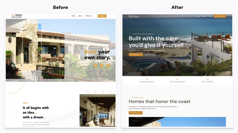
The previous website no longer reflected the quality of Eduardo’s architectural work. While functional, it lacked visual hierarchy, consistency, and the level of refinement expected from a modern architecture portfolio.
The challenge was not to create an experimental or highly interactive experience. Instead, the objective was to design a platform that felt timeless, trustworthy, and easy to navigate for a very specific audience: primarily foreign clients over 50 years old looking to build a second home, retirement property, or vacation residence in Baja California.
Many modern architecture websites lean heavily into brutalist trends, unconventional layouts, or editorial-style navigation patterns. During research, I found that while visually ambitious, many of these experiences sacrificed usability and clarity — especially for less tech-oriented audiences.The project required balancing two priorities:
Another important challenge was scalability. Since the architect needed the ability to independently upload and manage projects in the future, the platform required a structured and flexible CMS architecture. The project was built using a headless CMS approach with Sanity CMS, allowing future project expansion without compromising consistency.
The discovery process focused on understanding how contemporary architecture studios present their work online and identifying what was missing from those experiences.
I explored a wide range of modern architecture websites and noticed two recurring patterns:
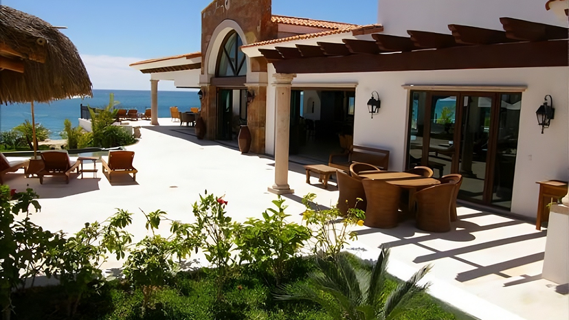
This project had a much more focused goal: create a clean, portfolio-driven experience that allowed the architect to quickly present his work from any device — sometimes directly from his phone during conversations with potential clients.
The design strategy centered around:
The final solution focused on creating a calm and immersive browsing experience that allowed the architecture itself to become the primary visual element.
The homepage introduces the work through a large hero carousel featuring selected residential projects with dramatic coastal views. Instead of relying on heavy animations or experimental interactions, the experience emphasizes clarity, pacing, and photography.
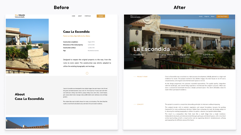
One of the key UX decisions was simplifying project exploration. Inside each project page, users can seamlessly navigate to the next or previous project directly from the hero section, eliminating the need to repeatedly return to the main project index.
This created a more fluid browsing experience, particularly beneficial for users casually exploring multiple homes and architectural styles.
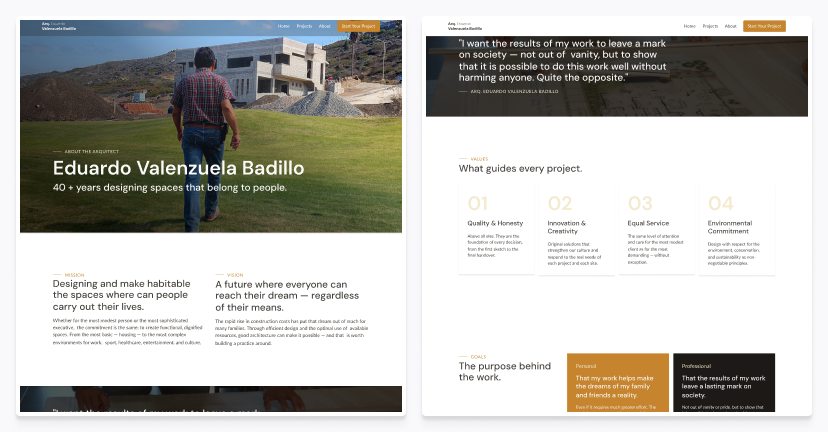
The platform was designed and developed entirely by me and is currently still evolving as new projects and photography continue to be added. The modular CMS structure ensures the architect can continue expanding the portfolio over time without redesigning the experience.
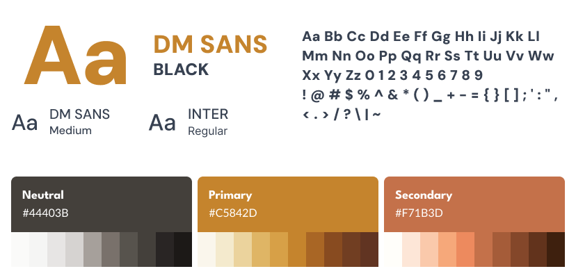
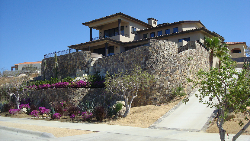
The visual direction was intentionally restrained and warm, inspired by the architectural atmosphere of Baja California: coastal landscapes, desert tones, sunlight, concrete textures, and contemporary residential design.
Working directly with the founder allowed for agile decision-making focused on business value.
