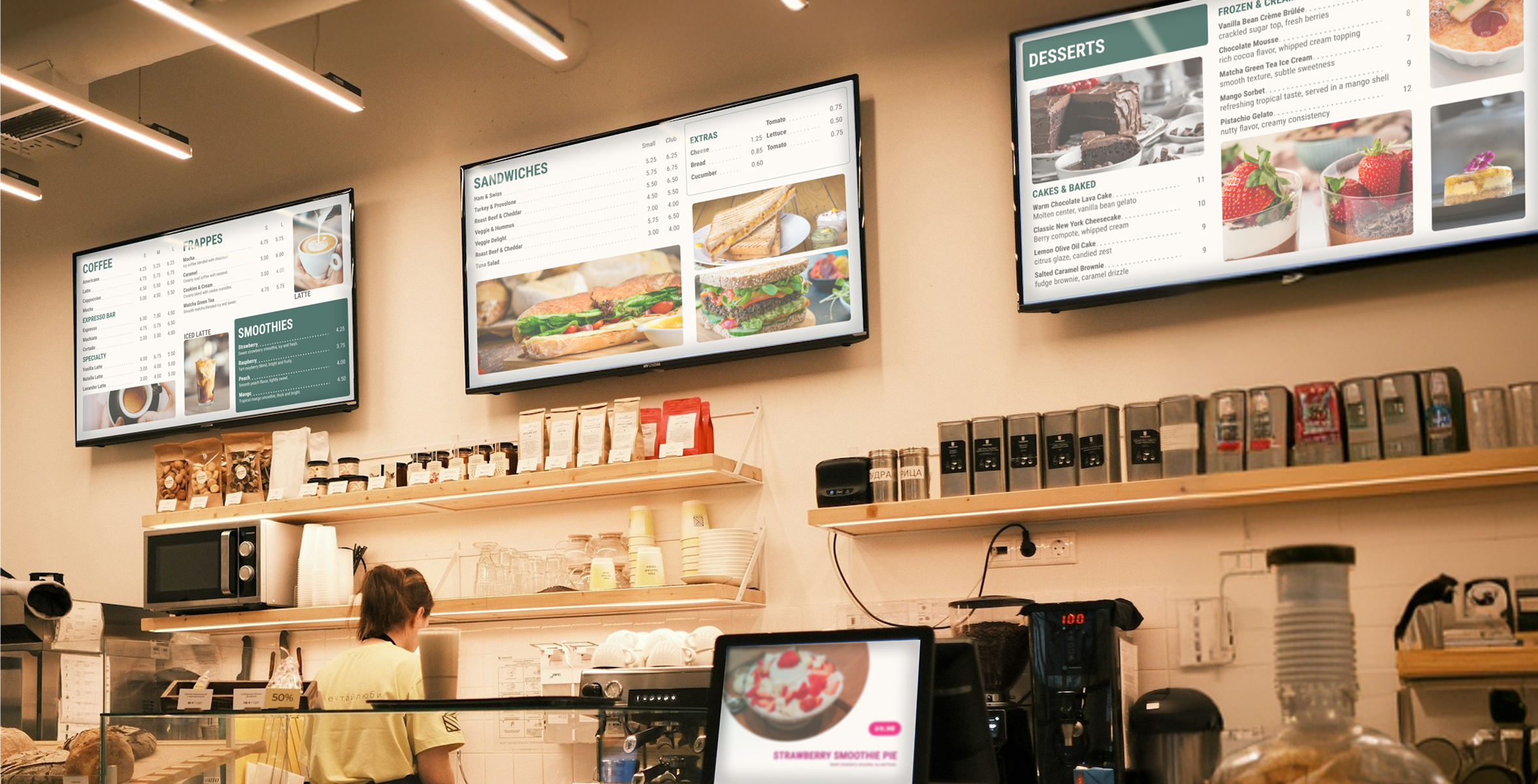
Digital Signage Platform began as a lightweight content management system designed to control what would be displayed across commercial screens and televisions, with an early emphasis on restaurant digital menus.
I was initially brought into the project to redesign a small number of existing screens. However, after evaluating the state of the product, it became clear that the challenge extended far beyond visual polish. The platform lacked a cohesive identity, onboarding was fragmented, workflows assumed prior product knowledge, and the overall experience created friction for first-time users.
I gradually took ownership of the UX direction of the product, redefining flows around accessibility and clarity for new users, establishing an initial design language to unify components and interactions, and restructuring the experience from the ground up.
The first redesign cycle took roughly one month, encompassing product analysis, workflow restructuring, identity definition, redesigning existing interfaces, and introducing entirely new experiences.
What began as a CMS redesign eventually evolved into a broader ecosystem consisting of:
All products were designed to function across desktop and mobile environments, enabling users to manage their content from virtually anywhere.
The original vision was relatively straightforward: launch a functional CMS MVP quickly, acquire customers, and begin validating the business.
But the product scope did not remain stable for long.
While redesign and implementation of the core CMS were underway, the roadmap expanded into a second major product: an AI-powered menu builder intended to become the platform’s most attention-grabbing feature.
From a UX and product perspective, this introduced a significant tension.
The initial CMS had not yet undergone meaningful validation, usability testing, or real-world feedback cycles. Expanding the MVP before validating foundational assumptions increased complexity, introduced new technical challenges, and continuously shifted what “launch-ready” actually meant.
Throughout the project, I found myself navigating an evolving product vision where priorities, feature expectations, and MVP boundaries frequently changed.
Rather than operating inside a stable roadmap, the work became an ongoing balancing act between:
This dynamic made cross-functional communication essential.
Because feature definitions evolved constantly, I maintained close collaboration with engineering to validate technical feasibility, understand implementation implications, and shape solutions that respected both the stakeholder's objectives and development realities.
Before redesigning interfaces, I began by auditing the product's existing state.
The platform suffered from fragmented navigation, unclear system structure, inconsistent UI patterns, and little guidance for inexperienced users. There was no established design identity, which made components, interactions, and layouts feel disconnected from one another.
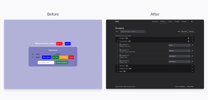
My first strategic move was to reframe the experience around a simple question:
How can a completely new user go from zero setup to displaying content on a screen with minimal cognitive load?
That shift influenced nearly every design decision that followed.
I rapidly established an initial visual system to standardize patterns, component behavior, hierarchy, and interaction consistency. This was intentionally lightweight but strong enough to provide cohesion across an expanding ecosystem of features.
At the same time, I worked closely with development to continuously evaluate feasibility as product requirements evolved.
Because the roadmap was highly fluid, design could not operate in isolation. Many conversations became less about designing ideal experiences and more about translating business ambitions into solutions that could realistically fit timelines, technical capacity, and product maturity.
This became especially important during development of the Menu Builder, where feature expectations continued expanding beyond the original scope.
My approach increasingly focused on identifying minimum viable interaction models capable of delivering value without collapsing under complexity.
The redesigned CMS prioritized clarity, guided setup, and reduced onboarding friction.
Authentication was introduced through traditional email registration with verification, alongside Google sign-in options.
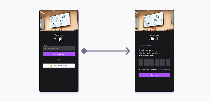
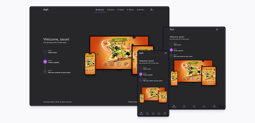
From there, users were guided through a simplified onboarding experience centered around three foundational actions:
1. Create a Screen
Connecting a physical display to the platform.
Users could link screens through two methods:
In both cases, the display generated a six-digit connection code that users entered inside the platform to establish a persistent pairing.
2. Create a Playlist
Users could build playlists composed of images functioning as automated content sliders, with customizable timing controls per slide.
3. Display Content
Users could assign playlists directly to connected screens and begin broadcasting immediately.
By reducing the setup journey into a small number of understandable milestones, the platform became significantly easier to approach for first-time users.
As the system matured, organizational complexity became an important consideration.
To support businesses managing multiple environments, I introduced the concept of Locations.
Rather than forcing a single organizational model, Locations allowed users to structure screens however they preferred — by branch, room, department, venue area, or any operational logic that suited their workflow.
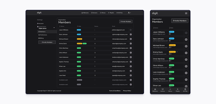
The platform also evolved into a multi-role administration environment.
Three permission levels were defined:
Additional organizational preferences and billing controls were scoped according to role responsibilities.
The goal was not simply permission gating, but creating a governance model that could scale alongside business growth without overwhelming smaller teams.
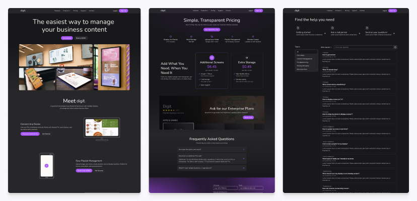
Once the core platform stabilized, a marketing website was developed to support acquisition, onboarding, and product discoverability.
Rather than functioning as a simple landing page, the website was designed as a content ecosystem centered around:
This expanded the user experience beyond the application itself and reinforced a broader product strategy around discoverability and self-service learning.
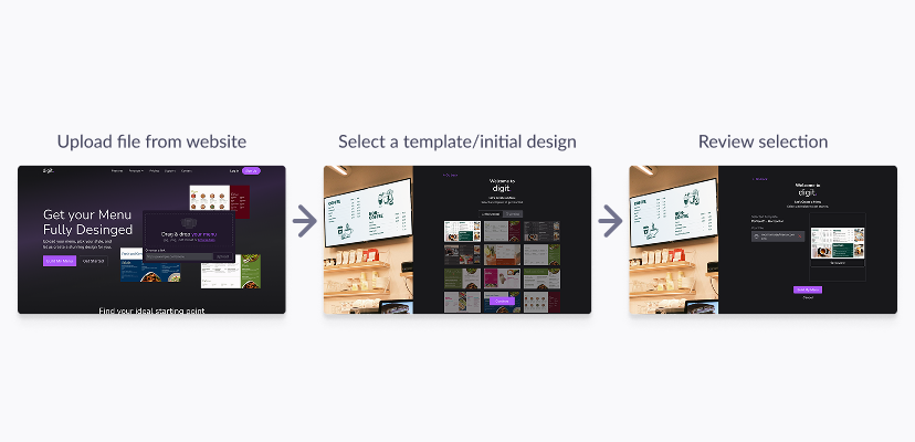
The most ambitious expansion of the platform came with development of a responsive menu editor powered by AI.
The vision was compelling: enable users with little or no design experience to generate professional digital menus with minimal effort.
The workflow began by selecting a template and uploading an existing menu asset, typically an image or PDF.
AI would then analyze the source material and synchronize the extracted content with the selected layout, generating an editable starting point.
From there, users could:
However, building the editor introduced substantial product complexity.
One of the recurring conversations throughout this phase revolved around MVP definition.
My position consistently leaned toward validating the simplest functional version first: create a menu, edit essential content, publish successfully, and learn from user feedback before expanding feature depth.
But expectations continued growing.
Requests emerged for richer customization, deeper editing capabilities, animation systems, and increasingly advanced presentation controls.
Rather than implementing fully freeform motion design tooling — which would have significantly increased complexity — I worked toward simplified alternatives that could preserve creative flexibility while remaining technically realistic.
Some ideas were intentionally reduced in scope. Others evolved into lightweight visual enhancements, such as configurable background depth elements and subtle animated environmental effects.
These decisions reflected an ongoing pattern throughout the project: preserving product ambition while actively negotiating complexity boundaries.
A second major challenge emerged around responsive editing workflows.
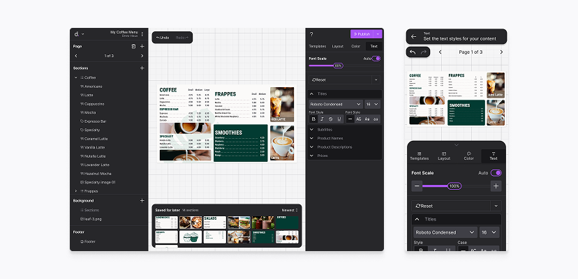
The editor needed to function seamlessly across desktop and mobile devices, but the interaction model changed dramatically between form factors.
On desktop, the interface could comfortably expose structure, editing controls, previews, and configuration tools within a single working surface.
On mobile, even seemingly simple actions often fragmented into multiple views, states, or sequential interactions due to limited screen real estate.
Rather than treating mobile adaptation as a later optimization, I approached this portion of the project entirely mobile-first.
This strategy forced early prioritization of essential actions, clearer information hierarchy, and simplified interaction patterns before expanding them into desktop layouts.
Designing mobile-first also helped surface hidden complexity early in the process, revealing workflows that appeared straightforward on large screens but became unnecessarily cumbersome on smaller devices.
The result was a more intentional editing experience capable of supporting content creation across environments without relying exclusively on desktop workflows.
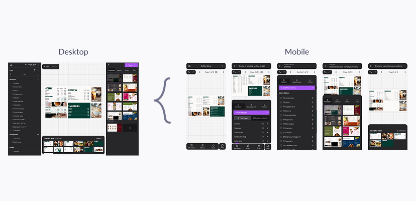
To support flexibility without introducing chaotic layout behavior, I designed the menu editor around a modular section-based architecture rather than floating canvas elements.
Each menu page behaved as a structured grid.
Users could place modular sections of varying dimensions and populate them with:
When content exceeded available capacity, users could extend their menu across additional pages rather than fighting constrained layouts.
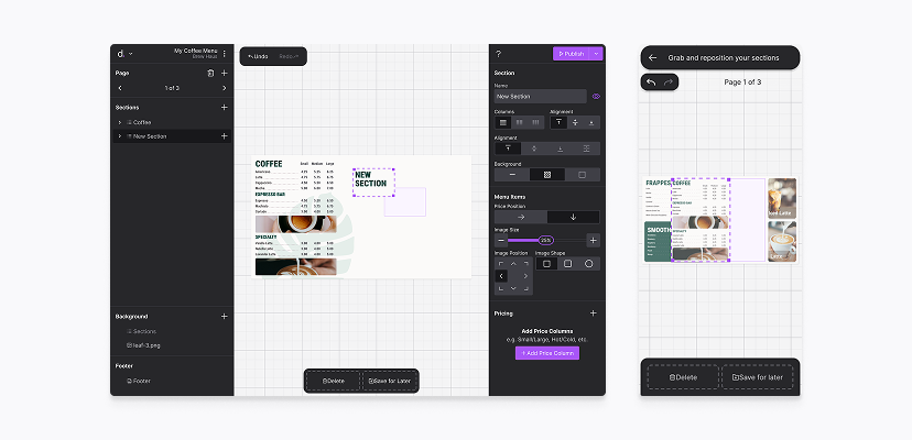
Typography and color styling were managed globally, ensuring visual consistency throughout the menu while minimizing repetitive configuration.
Every interaction was designed with both desktop and mobile workflows in mind, allowing users to manage content creation from virtually anywhere.
The project ultimately grew far beyond its original redesign brief.
What started as a small interface refresh evolved into a multi-product digital signage ecosystem spanning content management, device pairing, organizational administration, educational marketing, and AI-assisted content creation.
From a design perspective, the work resulted in:
Perhaps more importantly, the project became a practical lesson in navigating product ambiguity.
Working within continuously evolving requirements reinforced the importance of:
Beyond the interfaces themselves, this project sharpened my ability to operate inside messy, fast-moving product environments — translating shifting ideas into tangible systems while continuously negotiating between user needs, technical constraints, and business ambition.
