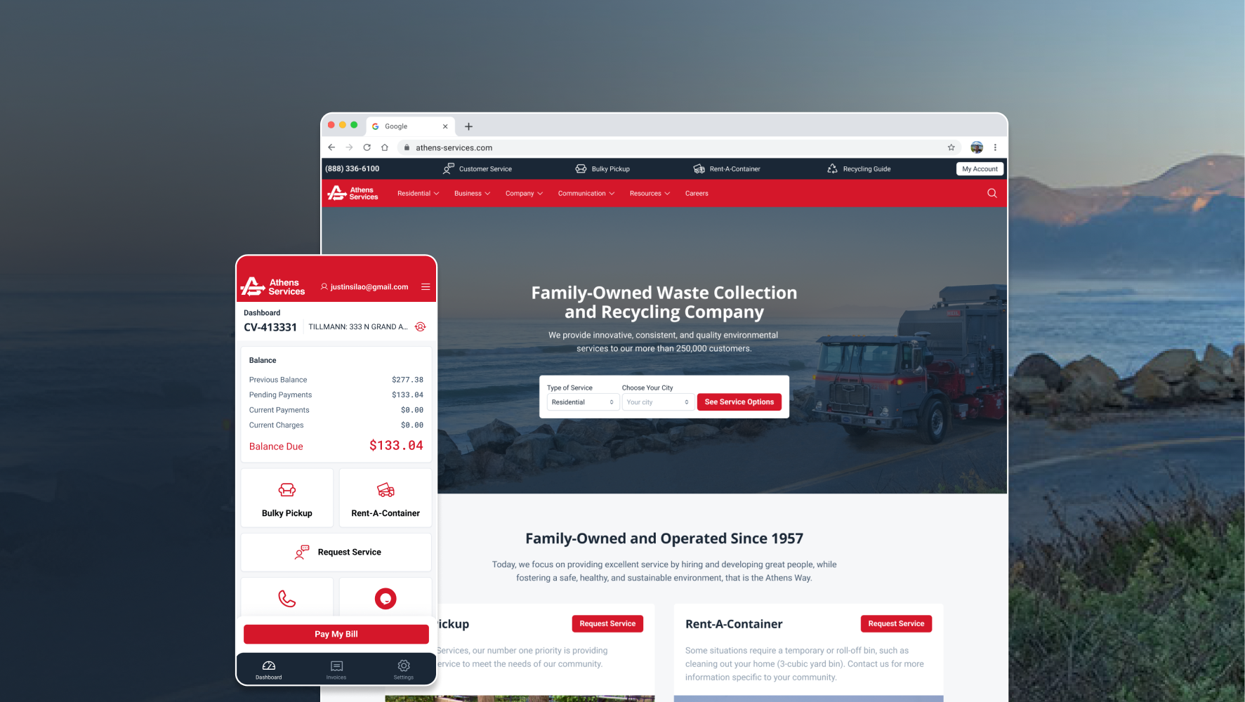
Transforming a fragmented waste management ecosystem into a scalable self-service experience.
Athens Services is one of the largest independently owned waste collection and recycling companies in Southern California, serving residential communities, businesses, contractors, and municipalities across Los Angeles County.
Over time, both the public website and customer billing platform had grown into large, disconnected ecosystems. Information was difficult to discover, service experiences varied between communities, and critical customer actions often required phone support.
The project focused on modernizing both experiences through a unified design system, a restructured information architecture, and a self-service-first approach that reduced friction across service requests, billing, and account management.
As Athens Services expanded its digital presence, its website accumulated years of content, service pages, community-specific variations, and support resources.
The result was a platform that had become increasingly difficult to navigate.Users often struggled to discover available services, locate community-specific information, or complete common tasks without contacting customer support.
At the same time, the existing billing platform suffered from a different but related problem.
While customers could technically manage invoices and payments online, critical information was buried behind multiple navigation layers, making common actions such as reviewing balances, locating invoices, or making payments unnecessarily difficult.
The challenge was not simply to modernize the interface.It was to reorganize an increasingly fragmented ecosystem into a scalable digital experience that encouraged self-service adoption and reduced dependence on traditional support channels.
Business Goals
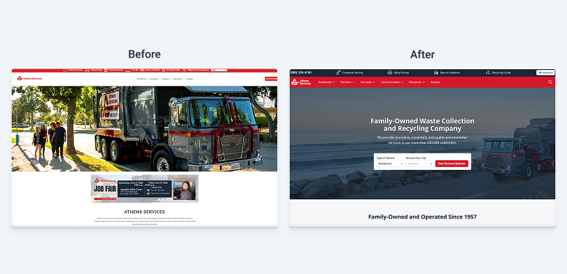
The first challenge was understanding the true scale of the platform.
The public website alone consisted of more than fifty core page templates, many of which supported multiple community-specific variations. While services shared common structures, content frequently differed between municipalities, creating inconsistencies across experiences.
A large portion of the discovery phase focused on:
This process revealed a recurring pattern: The issue was rarely missing content, the issue was that users often had no clear path to finding it.
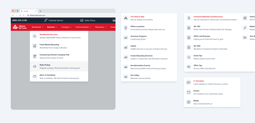
One of the most significant efforts involved restructuring the site's navigation model. Rather than organizing content around internal structures, the experience was redesigned around user goals and service discovery.
Key improvements included:
The result was a more scalable architecture capable of supporting multiple communities without creating entirely separate experiences.
A major strategic shift involved repositioning the website from a primarily informational platform into a task-oriented service portal. Instead of forcing users to search through content before taking action, critical services became directly accessible throughout the experience.
Priority actions included:
This approach reduced the distance between information and action, helping users complete tasks more efficiently.
Creating Consistent Service Experiences
One of the largest UX challenges involved community-specific service offerings.
Historically, many communities maintained unique page structures and forms, creating inconsistencies throughout the ecosystem. To address this, we established reusable templates capable of adapting to different service configurations while maintaining a consistent user experience. This approach simplified maintenance, improved scalability, and reduced confusion when users moved between service areas.
Service Request Flows
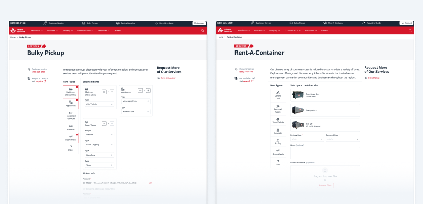
Several high-priority services required dedicated request experiences. Notably:
These flows were redesigned to support digital completion while accommodating operational requirements such as service location verification, conditional form logic, and community-specific eligibility rules.
Rather than maintaining separate experiences for every municipality, flexible form structures were created to adapt dynamically to different service configurations.
Designing Around Customer Priorities
Research and workflow analysis revealed four recurring customer goals:
The existing platform required users to navigate across multiple sections before reaching this information. The redesign introduced a dashboard-first approach that prioritized visibility over navigation.
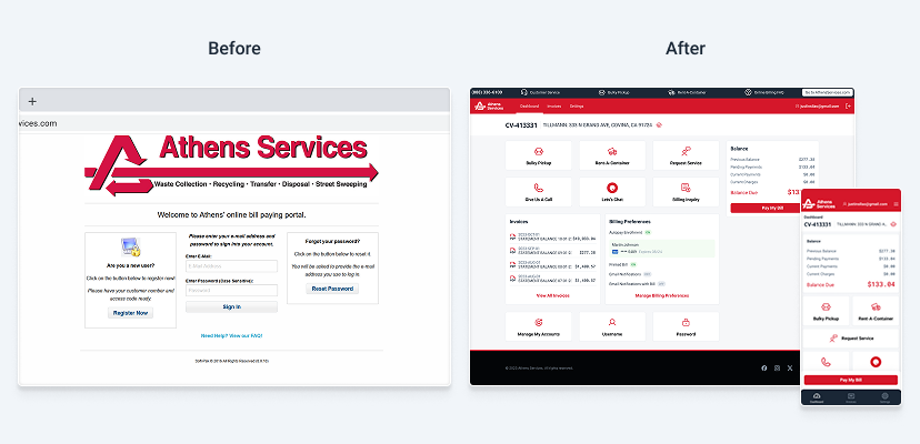
A Centralized Account Dashboard
Instead of hiding financial information behind multiple screens, the new dashboard surfaced critical account information immediately. Key information included:
Quick-access actions further reduced friction by providing direct entry points to the most common customer tasks. The objective was simple: Reduce the number of steps required to understand and manage an account.
Simplifying Billing Workflows
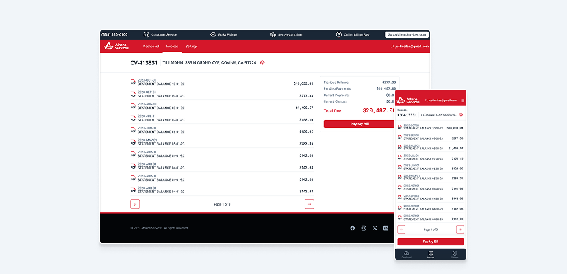
The billing experience was redesigned as a connected ecosystem rather than a collection of separate pages. Core flows included:
Dashboard → Invoices → Payment → Confirmation
Additional flows supported:
Each flow followed consistent interaction patterns across desktop and mobile devices.
Building a Shared Design System
Because the website and billing portal were developed simultaneously, consistency became critical. A shared design system was created to support both products through:
The system provided a common language for designers and developers while improving implementation consistency across products.
Building a Visual Language for Utility Services
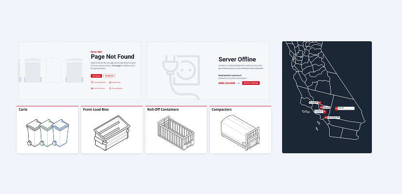
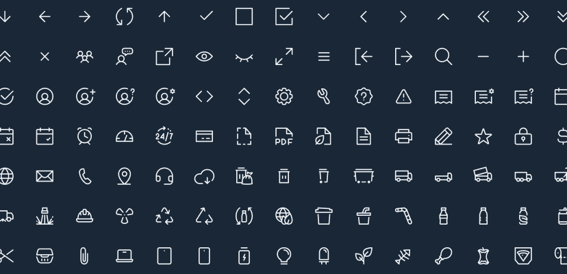
One of my primary contributions was developing the project's visual language. In addition to designing the complete iconography library, I created custom illustrations used throughout the ecosystem.
Rather than serving as decorative assets, these illustrations were intentionally designed to explain services, support onboarding, and communicate operational concepts that would otherwise require lengthy written explanations. This helped make complex waste management services more approachable while maintaining a professional and trustworthy tone.
Midway through the project, I transitioned into the lead design role after the original lead designer moved to another initiative.
From that point forward, I became responsible for maintaining design consistency across both products, refining user flows, completing pending experiences, expanding the design system, and supporting implementation readiness.
This transition provided an opportunity to guide the final stages of the project while ensuring alignment between the public website and customer portal experiences.
The project successfully established a more cohesive experience across Athens Services' digital products.Outcomes included:
Beyond individual screens or flows, the project created a stronger foundation for Athens Services' long-term digital transformation strategy.
This project reinforced the importance of designing beyond interfaces.
Many of the most impactful decisions were not visual—they involved organizing complexity, creating scalable systems, and helping users accomplish tasks with less effort.
It also marked an important step in my professional growth, transitioning from contributor to design owner while helping bring consistency across a large-scale digital ecosystem.
